Every June, Pride Month brings a vibrant display of color to communities, businesses, and social media feeds around the world. The Pride flag has become one of the most recognizable symbols globally. And that’s not simply because it’s colorful, but because each color carries meaning and contributes to a larger story of identity, unity, and belonging.
It’s a powerful reminder that color is more than just a design element.
Colors tell stories, represent identities, and influence how people feel before a single word is spoken. It influences how we feel, what we notice, and even how we make decisions. Color shapes our impressions within seconds.
For brands, the same principle applies. When it comes to branding, impressions often happen long before someone physically interacts with a product or service. So, whether it’s in the format of a logo, website, marketing campaign, or physical card product, the colors you choose shape first impressions and tell your brand’s story.
Why Color Matters
Color is one of the most influential visual elements. Think about some of the most recognizable brands. Chances are that you can picture their colors immediately. That’s because color helps create recognition, consistency, and emotional connection.
While color associations can vary based on culture and personal experience, certain emotional responses are commonly shared:
- Red: energy, passion, urgency
- Orange: confidence, friendliness, enthusiasm
- Yellow: optimism, creativity, warmth
- Green: growth, sustainability, wellness
- Blue: trust, reliability, security
- Purple: innovation, luxury, imagination
- Pink: compassion, warmth, creativity
- Brown: stability, authenticity, dependability
- Black: sophistication, authority, elegance
- White: simplicity, clarity, transparency
These associations help explain why financial institutions often use blue, eco-friendly brands gravitate towards green, and luxury brands frequently incorporate black.
Color helps communicate who a brand is before a customer ever reads a single word.
Lessons from Pride Month
One of the most compelling aspects of the Pride flag is its ability to communicate meaning through color alone.
The flag demonstrates how colors can represent values, experiences, and identity. Together, they create a visual language that people instantly recognize and connect with.
For brands, this serves as an important lesson: color is most effective when it supports a purpose.
People today are increasingly aware of the difference between meaningful representation and surface-level design choices. The strongest brands don’t choose colors simply because they’re trendy or visually appealing. They choose colors that align with their mission, personality, and audience, which helps build trust and loyalty.
When color choices are intentional, they create stronger recognition and a more memorable brand experience for customers and employees.
Bringing Color Psychology to Card Products
Brand identity doesn’t stop at a logo or website. Every touchpoint should reinforce the same message, including physical card products.
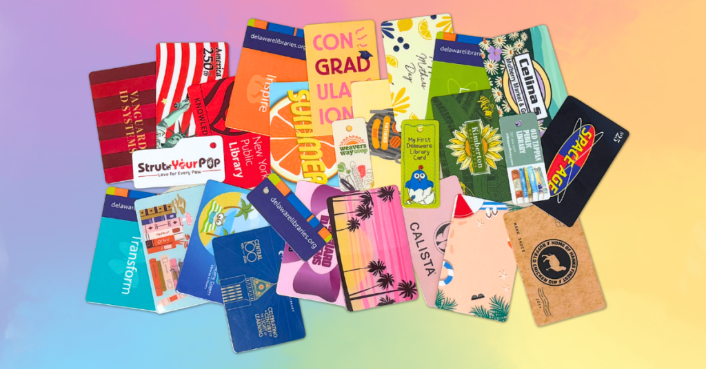
Gift cards, membership cards, event badges, rewards cards, employee badges, and business cards often serve as one of the most tangible connections between a brand and its audience. A customer will only visit your website occasionally, but they will see your card every day.
Because of this, card design has a significant impact on perception. It influences who your customers are and their habits when it comes to your brand.
What Your Card Products Say About Your Brand
Since physical cards often serve as a customer’s first tangible interaction with your organization, every design choice contributes to perception. Different card products serve different audiences and objectives, but color remains a powerful tool for influencing perception across each one.
- Gift Cards – Designed to create excitement and anticipation, gift cards often feature vibrant colors and seasonal palettes that evoke positive emotions and encourage engagement with a brand.
- Membership Cards – Membership cards represent belonging and community. Color choices can reinforce exclusivity, trust, or inclusivity, depending on the organization’s goals and audience.
- Event Badges – Event badges serve as both identification and branding tools. Bold, recognizable colors help attendees navigate events while strengthening brand visibility and creating a memorable experience.
- Rewards Cards – Rewards cards are designed to encourage repeat engagement. Bright, energetic colors can create feelings of excitement and motivation, while darker tones can evoke a sense of prestige and exclusivity, reinforcing the value of participating in the program.
- Employee Badges – Employee badges reflect company culture and professionalism. Clean, cohesive color schemes help create a sense of unity while reinforcing an organization’s brand identity.
- Business Cards – A business card serves as a lasting representation of your brand, long after the conversation ends. Color choices can help reinforce professionalism, creativity, trust, or innovation while making your card more memorable.
Whether it’s carried in a wallet, worn at an event, or displayed in the workplace, every card is an opportunity to reinforce your brand. Thoughtful color choices help create consistency across touchpoints while communicating the values, personality, and experience your organization wants to deliver.
Designing with Intention
Color is one of the most powerful tools in branding, influencing how people perceive and connect with your organization. When selecting colors for your card products, it’s important to think beyond aesthetics and consider the message your design is sending:
- What emotions should customers feel when they receive the card?
- What values should it reflect?
- Does it align with your overall brand identity?
- Will it resonate with your audience?
Pride Month reminds us that color has the ability to communicate meaning, foster connection, and express identity without saying a word. The most effective card designs do more than look good…they tell a story. Whether it’s a gift card, membership card, event badge, rewards card, employee badge, or business card, every color choice contributes to how your brand is perceived. By designing with intention, you can create card products that not only capture attention but also reinforce the values, personality, and experience that define your brand.